These six therapist website examples show how strong photography, distinctive typography and a considered color palette can give a practice a memorable online presence. We chose them for their visual character, with desktop and mobile screenshots so you can see how each design changes across screens.
If you are looking for the best therapist websites for inspiration, start with the details that suit your practice: Mesa Family Therapy’s cinematic opening, Guided Grace’s bold portraits or Design Your Life Centre’s expressive typography. Each practice appears in our case-study library; the screenshots show its current live website.
1. Mesa Family Therapy: a cinematic opening with a restrained palette
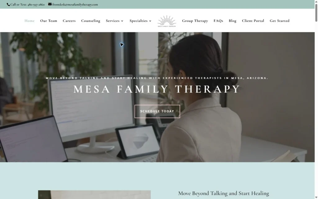
Mesa Family Therapy in Arizona gives its homepage a spacious, editorial feel. The pale green contact strip, centered sunburst logo and large serif practice name establish the visual direction before a visitor scrolls.
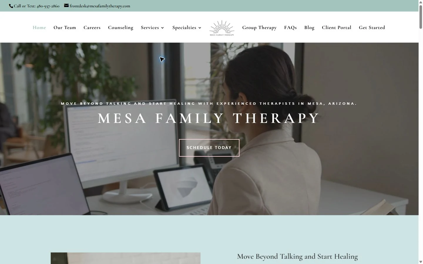
Why it stands out: The strongest choice is the full-width video behind a short introduction and one outlined scheduling button. The footage supplies movement and atmosphere; the typography stays quiet enough to let it work. A dark overlay helps the white lettering remain readable, while the pale blue-green section below carries the color through the page.
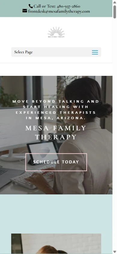
On mobile: On mobile, the long desktop navigation becomes a compact menu. The practice name and Schedule Today button remain the focus over the background footage. Compare the two screenshots: the layout changes, but the color, type and central action still belong to the same brand.
Idea to adapt: Build the opening around one strong visual, one short message and one next step. If you use video, check the text against several frames and provide a useful still image for visitors who cannot play it.
Visit Mesa Family Therapy · View the case study
2. Guided Grace: bold color and a distinctive portrait composition
Guided Grace Family & Youth Services uses deep blue, yellow and orange to create a more expressive first impression. Its Michigan location appears in the main headline, beside two large portrait cutouts.
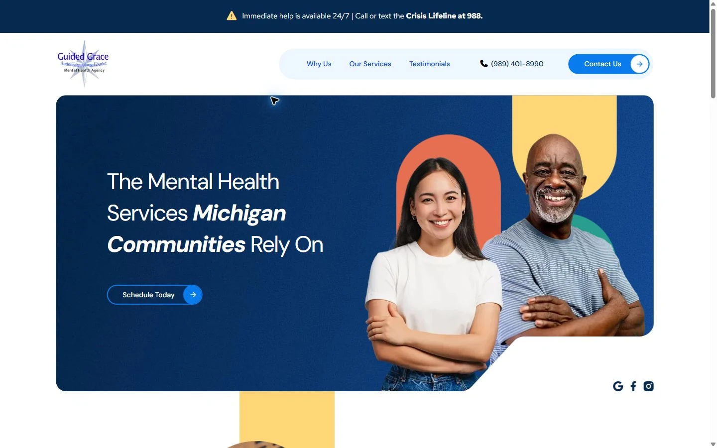
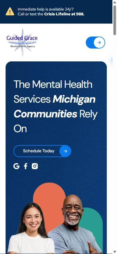
Why it stands out: The curved lower edge of the blue panel, tall colored shapes and overlapping portraits give the opening a recognizable composition. The faces are large enough to carry the image, while the heading has room on the left. A compact navigation bar keeps the primary contact action separate from the artwork.
On mobile: The mobile layout places the headline and Schedule Today button ahead of the portraits. The colored shapes continue behind the images further down, so the page keeps its character when the desktop arrangement stacks. A separate contact control remains in the header.
Idea to adapt: Choose a small set of colors and repeat a distinctive shape. Here, those choices give ordinary page elements a consistent identity. Keep the service and location easy to read alongside the visual treatment.
Visit Guided Grace Family & Youth Services · View the case study
3. Design Your Life Centre: expressive typography for a psychology practice
Design Your Life Centre is a Toronto clinical psychology practice founded by Dr Stacy Thomas. For readers collecting psychologist website examples, this is a strong reference for large serif type, a rich teal palette and an emotionally direct opening.
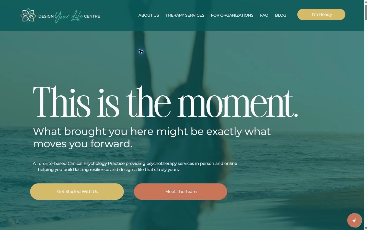
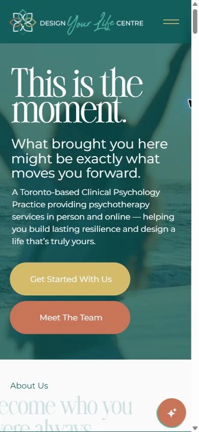
Why it stands out: The headline occupies most of the desktop width, with supporting copy beneath it and two rounded buttons in gold and terracotta. A teal overlay ties the background imagery to the header. The composition gives the headline prominence without hiding the practical explanation that this is a Toronto practice offering psychotherapy in person and online.
On mobile: The headline wraps into a compact block, and the two buttons stack below the practice description. Get Started With Us and Meet The Team offer different next steps. The first leads to the contact page; the second lets visitors learn about the clinicians before reaching out.
Idea to adapt: Pair expressive language with a plain description of your service, location and session format. A memorable opening still needs to tell someone what kind of practice they have found.
Visit Design Your Life Centre · View the case study
4. Wellspring Counseling: an elegant layout built around the team
Wellspring Counseling serves Greenville and Taylors, South Carolina. Its cream background, navy serif heading and team photograph create a warm, polished alternative to a full-screen background image.
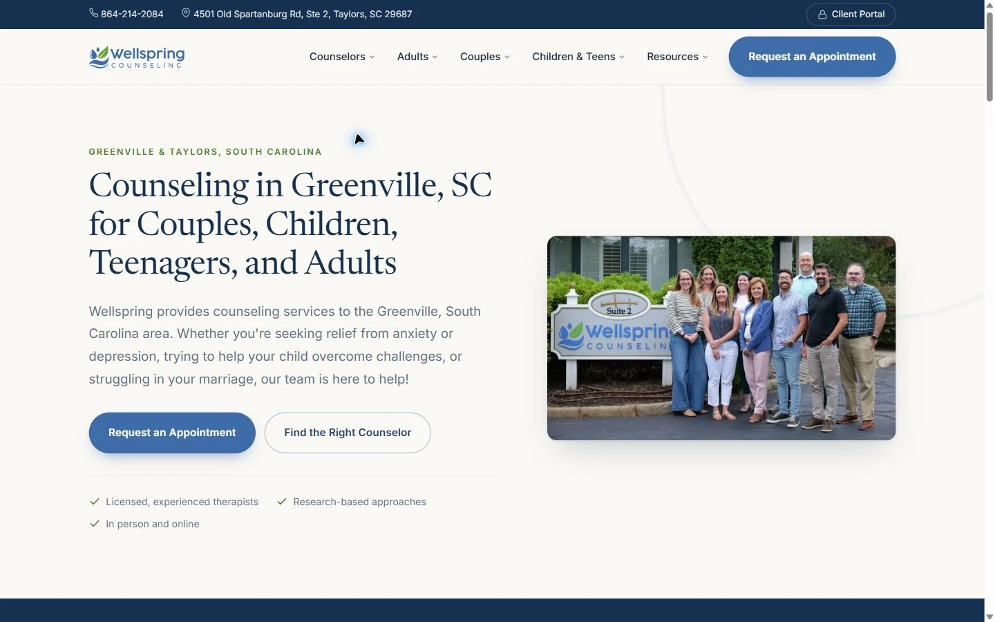
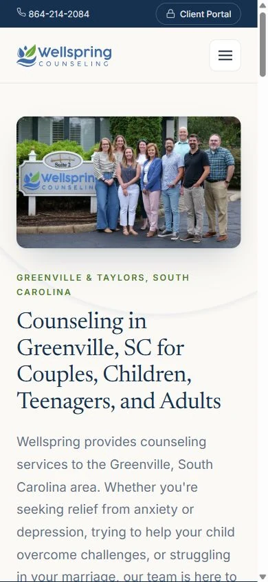
Why it stands out: The desktop layout balances a detailed introduction on the left with a photograph outside the practice on the right. Blue buttons stand out against the cream, while a fine divider separates the introduction from the short supporting points. The header names the main audiences: adults, couples, children and teens.
On mobile: On a phone, the team photograph appears before the main introduction. That change makes the people a prominent part of the first impression. The longer headline takes more vertical space, so visitors scroll to reach the complete introduction and its choices.
Idea to adapt: A good photograph of your actual team can be the central design asset. Give it enough space, match the surrounding colors to the practice, and offer a way to explore clinicians as well as request an appointment.
Visit Wellspring Counseling · View the case study
5. Mind Body Pivot: a clean layout with a photographic mood board
Mind Body Pivot combines bold blue-and-black typography with a grid of quiet landscape and nature images. The homepage identifies Salt Lake County, Utah, and statewide telehealth above the main heading.
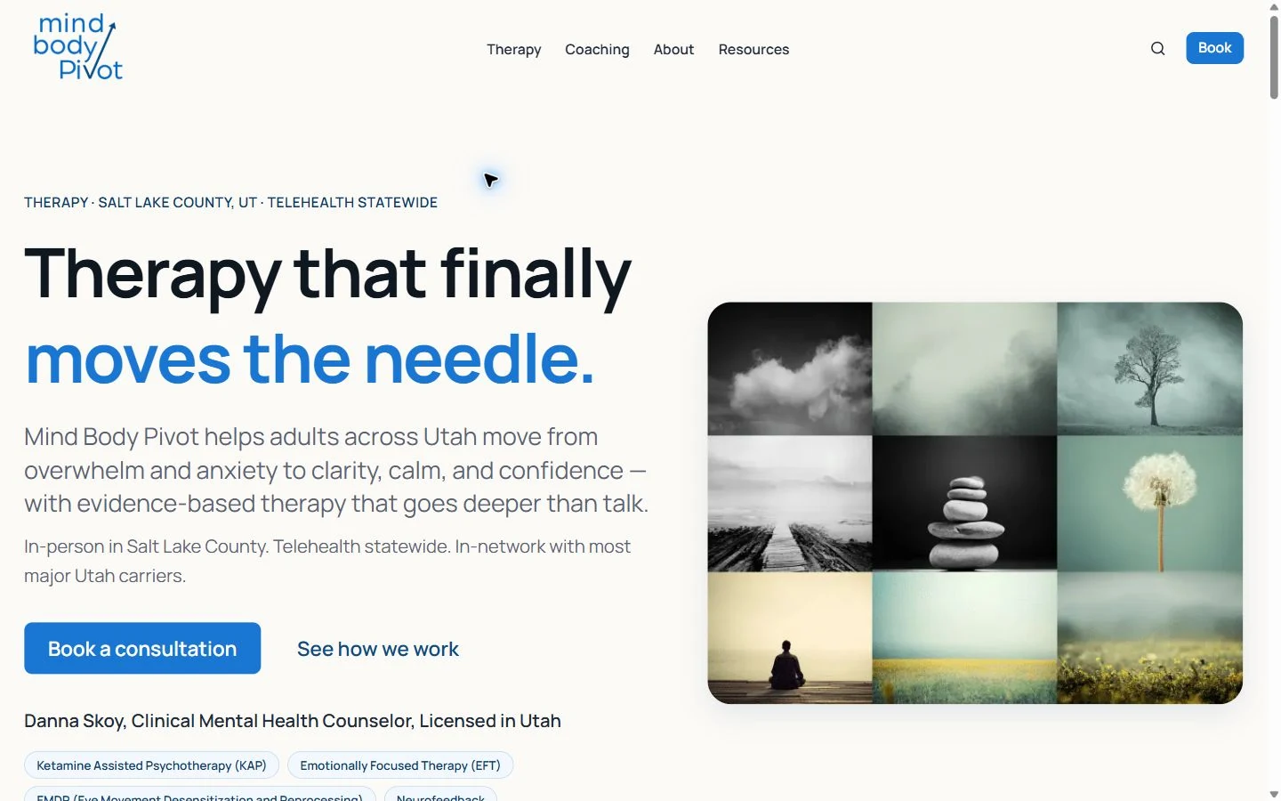

Why it stands out: The image grid gives the page a focal point without relying on a single generic counseling photograph. Rounded corners soften the collage, while the cream background leaves the large heading easy to scan. Blue connects the logo, emphasized words and consultation button.
On mobile: The phone view gives the large heading and supporting copy priority. The image grid moves further down, while Book stays in the header. This is a useful comparison for anyone considering oversized type: it has impact, but it also makes the mobile introduction longer.
Idea to adapt: Use a restrained color palette to connect a varied set of images. Keep the location and service format close to the headline, and check how far a mobile visitor must scroll to see the main image and next step.
Visit Mind Body Pivot · View the case study
6. Beverley Mack Harry Consulting: a strong portrait and purple identity
Beverley Mack Harry Consulting presents psychiatric, psychotherapeutic and medical services in Brooklyn, New York. Its homepage uses a large portrait and a purple color treatment to create a clear visual identity for this multidisciplinary practice.
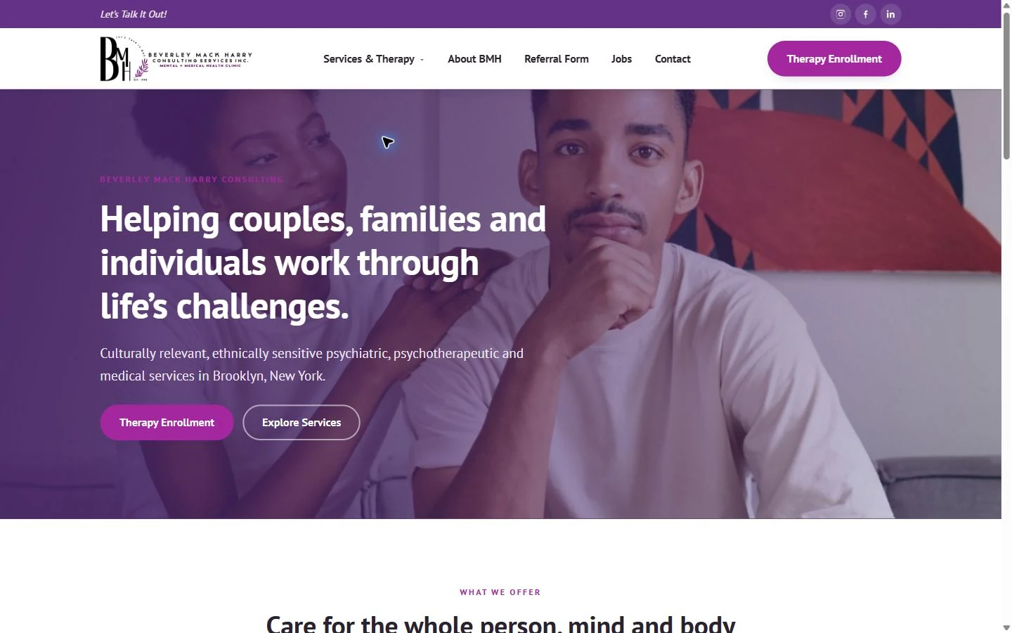
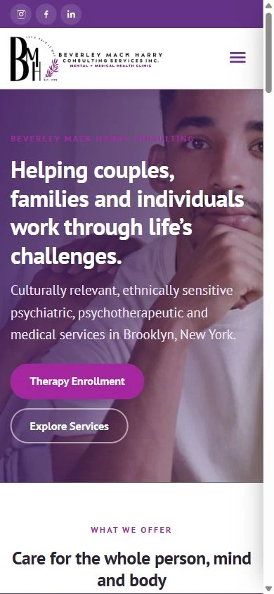
Why it stands out: The purple overlay gives the portrait and the text a shared backdrop. White lettering stands out over the darker side of the image, with the subject positioned toward the right. The Therapy Enrollment button repeats the purple family, while the secondary Explore Services button uses an outline.
On mobile: The portrait becomes a closer crop behind the opening text. That makes the image choice especially important: a photo that works across a wide screen also has to leave useful space in a narrow layout. The purple treatment helps the desktop and mobile versions feel connected.
Idea to adapt: Pick a hero photograph with both wide and narrow crops in mind. Test the text over the actual face, clothing and background that remain visible on a phone, then use a consistent overlay where it improves readability.
Visit Beverley Mack Harry Consulting · View the case study
Choosing a design direction for your practice
The best website design for therapists starts with a few deliberate choices. Mesa uses movement and a restrained palette. Guided Grace uses color and portrait cutouts. Wellspring makes the team photograph central. Choose the approach that fits the people, services and imagery you can actually present.
- Choose a focal point. Give a strong photograph, illustration or headline enough room to be noticed. Avoid making every part of the opening compete for attention.
- Keep practical details nearby. A visitor should be able to identify the service, location and next step alongside the visual introduction.
- Design the phone layout deliberately. Compare image crops, heading length, button placement and the order of content. Stacking the desktop columns is only the starting point.
- Match the action to your intake process. A request form, a consultation calendar and a client portal do different jobs. Label each one for what the visitor will find.
For a psychology practice, make the distinction between clinicians and services clear too. Our guide to website design for psychologists explains how we approach that work.
Screenshots and design observations: October 14, 2026. Our selections reflect editorial design judgment. Live websites may change, and inclusion in a case study does not attribute every element of a current website to Therapy Marketers.
Frequently asked questions
What should a therapist website include?
Include the people you help, your services, location and session format, clinician bios with accurate credentials, fees or insurance information, and a clear way to get in touch. The visual design should help visitors find those details and understand what happens after they request an appointment.
Which features matter most on the best psychologist websites?
Look for a distinctive visual identity alongside clear professional information. A strong psychology website explains who provides care, which services are available and how to start. If the practice offers both therapy and assessment, each needs its own explanation so visitors can choose the relevant route.
Should a therapist website have online booking?
Use the first step that fits your practice. Some teams need an inquiry or matching conversation before scheduling; others let visitors choose an appointment directly. Make the button label specific, explain what follows, and keep the existing-client portal separate from the route for new clients.
Can I copy a therapist website design I like?
Use the examples to study layout, image placement, typography and navigation. Develop your own branding and copy, and use photographs or illustrations you own or have permission to use. Adapt the underlying idea to your practice rather than reproducing another site’s distinctive design or content.
Want a Second Opinion on Your Website?
If it would help to talk it through, we are happy to look at your website and suggest where we would start.